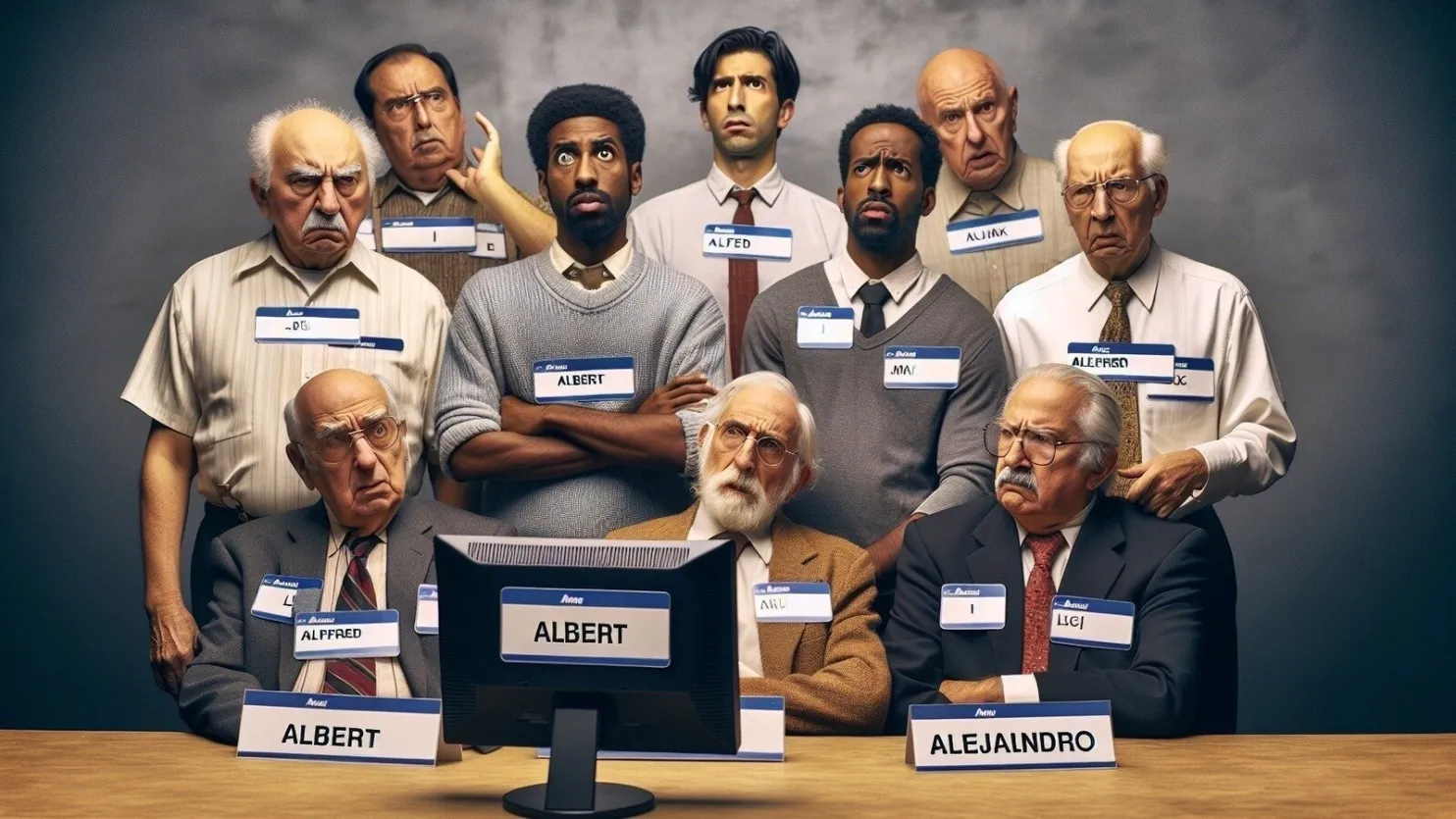
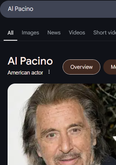
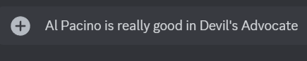
Is your name Al? Did someone think you wrote AI when you wrote your name, because of fonts that don't distinguish between l and I?
Well then, holy shit, you're in the right place.
You probably agree that enough is enough, and it's time to shine a light on this important societal issue.
Who should we hold accountable for this mess?
Bad guys using bad fonts:
1. Youtube

2. Google (in general)
3. Basically everyone these days.


Good guys using good fonts:
Discord
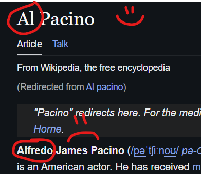
Wikipedia
Which fonts are bad?
- Inter
- Basically every sans-serif font, but I like to pick on Inter, because it's everywhere.
Bad fonts are the ones where l and I are both just a stick like this: |
Most sans-serif fonts fuck this up. Even in the best case, when l and I are different heights, unless you see them both in the same text, you won't always know which is being used.
I get wanting clean, modern looking fonts, but if two different letters are basically identical, then you're fucked, kid.
Which fonts are good?
- Monospaced fonts like this one (unless you are on a shitty device that displays it weird).
- Comic Sans. It truly is the greatest font—everyone agrees.
- Almost all serif fonts, I'd imagine.
- Buncha other ones. You look it up.
Really, any font that distinguishes l from I by more than just the height is good.
Will Big Website ever give us the representation we deserve?
I sure hope so. They'd really be dicks not to listen at this point.
What can I do?
Make sure you sign the petition below ↓